Skip to content

/

Burpy

Designing an all-in-one AI health app for how India eats

Burpy, Android app, real Figma frames

Three Burpy Android screens in plain phone frames, cut by the bottom edge: onboarding asking where your meals come from, with From outside open (tiffin service, P.G. food, canteen, hostel mess); Customise your plan with an 18,200 kCal weekly budget; and a photographed meal listed item by item with its calories. A pencil note: step 4 of 6, where your meals come from.Three Burpy Android screens in plain phone frames, cut by the bottom edge: onboarding asking where your meals come from, with From outside open (tiffin service, P.G. food, canteen, hostel mess); Customise your plan with an 18,200 kCal weekly budget; and a photographed meal listed item by item with its calories. A pencil note: step 4 of 6, where your meals come from.
Revamped onboarding (after the beta), Customise your plan (designed, not built), AI meal log (built in beta).
In 15 secondsBurpy
Problem
Burpy was for people who can’t afford a dietitian and eat without a plan. Calorie apps don’t fit Indian home food.
My role
First designer: intern, then founding product designer. I designed the flows for all 12 app areas.
Key move
Designing for an AI that guesses: onboarding that tells it how you eat, and a meal log you fix in plain words.
Result
A private beta for fewer than 30 friends and family in June 2024. Burpy closed in April 2025, before launch.
Company
Burpy, AI food and health startup, India
Role
Design intern, then founding product designer
Team
Founder (acting PM), co-founder, developers, an illustrator, a peer designer from mid-2024
Timeline
Dec 2023 – Jan 2025
Platform
Android app; waitlist website
Status
Private beta 2024, closed 2025
13 monthsas the first designer
8 of 12app areas reached beta testers
3AI features beta testers used
1area I argued to launch first: the planner
A Figma-style canvas of Burpy app screens beyond the meal planner: the recipe page, selected at 360 by 800, with groceries and trackers, and on wider screens cook with what you have, AI recipe import, support group, the ingredient page, share with cook and the paywall.A Figma-style canvas of Burpy app screens beyond the meal planner: the recipe page, selected at 360 by 800, with groceries and trackers, and on wider screens cook with what you have, AI recipe import, support group, the ingredient page, share with cook and the paywall.
From my Burpy Figma file. Groceries, AI recipe import and support groups were designed, not built.

Burpy closed in 2025. Personal names, phone numbers and partner logos on screens are replaced.

Problem

A diet plan nobody follows

Most people we talked to had the same story. The doctor gave them a list of foods to avoid, and nobody told them what to cook on Tuesday. Dietitians are very expensive in India, and calorie apps had no idea what to do with a plate of dal (lentils) and rotis (flatbreads).

The founder’s own research since 2021 found a second problem: paid diet plans are templates people drop.

One adaptive plan had to fit three kinds of eater:

  • people managing diabetes or high blood pressure

  • students and workers on PG (paying-guest) food, tiffins (delivered home-style meals) or hostel mess (shared dining hall) meals

  • families where a cook or house help makes the food

The condition manager

Who
People managing diabetes or high blood pressure
A plan must
Set limits after a diagnosis, or focus on prevention for a risk
What it changed in onboarding
Each condition asks: diagnosed, or at risk?

The PG or hostel eater

Who
Students and workers on PG (paying-guest) food, tiffins or hostel mess meals
A plan must
Work without a kitchen, around a fixed menu
What it changed in onboarding
From outside lists meal services like tiffins and hostel mess

The family with a cook

Who
Homes where a cook or house help makes the food
A plan must
Fit food someone else prepares
What it changed in onboarding
At home asks who cooks, for how many, and whether a child eats too

Three eating situations, one plan. Reconstructed for this case study from what we knew.

How it started

The recipe app changed its mind

Burpy began as the founder’s recipe app. In January 2024, I tore down six food apps. They were thin on Indian home food, ignored health conditions and never adjusted when you missed a meal. In design reviews, we moved Burpy to a meal plan.

  1. Dec 2023Joined as design intern
  2. Jan–Feb 2024Core moved to meal planning
  3. Jun 2024Full-time; private beta
  4. Apr 2025Burpy closed
Six phone screenshots from my January 2024 teardown of food and recipe apps, one per app, with app names, creators and logos blurred. These are their screens, not my work.Six phone screenshots from my January 2024 teardown of food and recipe apps, one per app, with app names, creators and logos blurred. These are their screens, not my work.
From my January 2024 teardown of six food apps. Brands blurred; these screens are theirs, not my work.
A loop diagram of how Indian households cook, from deciding what to eat to sharing the meal.
My early map of how India cooks. Every step became an app area, the first sign of sprawl.
Four phone screens in order: the founder’s recipe home as a grey box and in hi-fi, my grey-box meal planner from 2024, and Customise your plan, the weekly plan I designed, which was not built.Four phone screens in order: the founder’s recipe home as a grey box and in hi-fi, my grey-box meal planner from 2024, and Customise your plan, the weekly plan I designed, which was not built.
From the founder’s recipe screens to my weekly plan. Real frames from the Figma files.

Change 01Built in beta

Hostels don’t have kitchens

A plan that assumes a kitchen fails a hostel student on day one, and none of the six apps asked. So onboarding asks where meals come from, and every answer feeds the AI’s first plan.

From outside lists meal services like tiffins and hostel mess. At home asks who cooks, for how many, and whether a child eats too.

After the beta, I added a follow-up per condition: diagnosed, or at risk? A diagnosis needs limits; a risk, prevention.

Options
One fixed question list, or a branch on where meals come from
I chose
The branch, so nobody answers kitchen questions without a kitchen.
Trade-off
More screens, though each person sees one path.

Meal source

Where do you get most of your food?

From outside

Meal service: tiffin service, PG food, canteen, hostel mess

Which meals do you rely on? Breakfast, lunch, snacks, dinner

At home

For whom is the food prepared? Family, or myself only

Who prepares your food? Me, a family member, a cook, house help

Total number of members

Is there a kid in the family? (12 years or below)

AI plan generation uses these answers

Health conditions

At risk of, or already have: diabetes, high blood pressure, heart conditions, kidney disorders, thyroid…

For each condition: diagnosed, or at risk?

Diagnosed

The plan sets limits

At risk

The plan focuses on prevention

  • Edge caseMeal service is optional in v1, so people can skip it.
  • Trade-offEach person sees one path; the file holds both.
  • VersionThe diagnosed-or-at-risk follow-up came with the revamp, built after the beta.

One answer routes the rest of onboarding. Reconstructed for this case study from the screens.

Three onboarding screens from the revamp: From outside lists meal services such as PG food, tiffin, canteen and hostel mess; At home asks who prepares the food and how many people eat; and a bottom sheet asks whether high blood pressure is diagnosed or a risk.Three onboarding screens from the revamp: From outside lists meal services such as PG food, tiffin, canteen and hostel mess; At home asks who prepares the food and how many people eat; and a bottom sheet asks whether high blood pressure is diagnosed or a risk.
Screens from the revamp. Outside and home ask different questions; the at-risk follow-up, my addition, came after the beta.

Change 02Designed, not built

Swap dishes, see the week change

The AI’s first plan is a guess, and none of the six apps let a plan bend. With a locked plan, one disliked dish meant regenerating the whole week.

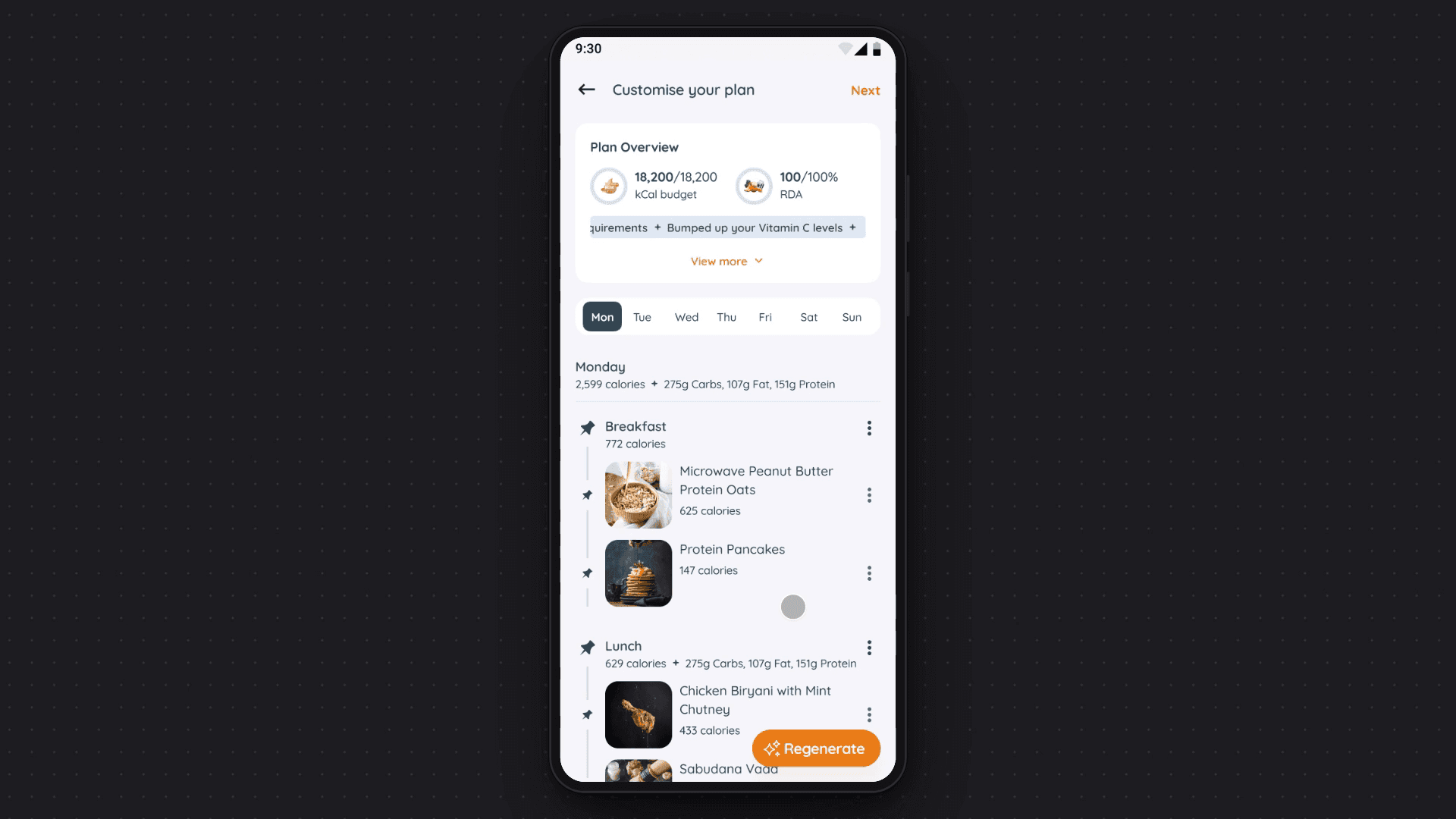
In Customise your plan, people pin dishes and Regenerate rebuilds around them. A top card shows the week’s calories and nutrients changing live.

The budget is weekly because Indian weeks are uneven: a Tuesday fast or a Saturday wedding shouldn’t fail the week.

Options
A locked plan, or an editable plan with pins and a live budget
I chose
The editable plan. The AI suggests, people decide, and the numbers catch a bad swap.
Trade-off
A dense screen with five actions, and the costliest build in the app.
In detail: what Customise your plan lets people do
  • Pin or unpin a dish; Regenerate keeps pinned dishes and rebuilds around them.
  • Drag a meal to another slot, or copy it to other days, with a choice to replace what’s there.
  • Add food from search, recommendations or favourites, with an undo after each add.
  • Read insights under the budget, such as low vitamin C, each with an Optimise action.
  • Save the plan with a tag (high protein, detox, balanced) and a duration, and generate a shopping list from it.
Before and after, annotated: my 2024 grey-box planner showing today’s meals with their macros, one day at a time, and Customise your plan, where a weekly kCal budget card sits above pinned dishes. Notes: every swap moves the week’s budget; pin a dish to keep it. Customise your plan was designed, not built.Before and after, annotated: my 2024 grey-box planner showing today’s meals with their macros, one day at a time, and Customise your plan, where a weekly kCal budget card sits above pinned dishes. Notes: every swap moves the week’s budget; pin a dish to keep it. Customise your plan was designed, not built.
The early layout only listed meals. The final plan shows what each change does to the week.
Animation of adding a banana at breakfast in Customise your plan: pinned dishes stay put and the week’s totals update.Animation of adding a banana at breakfast in Customise your plan: pinned dishes stay put and the week’s totals update.
Concept, not built: add a dish and the week’s numbers move, animated from Figma frames and one reconstructed state.

Change 03Built in beta

Snap it, fix it in words

People we talked to had given up logging home food in other apps: too much typing, too much guessing. In Burpy, you snap a photo and the AI lists each item’s calories.

When the AI is wrong, and sometimes it will be, a serving ruler fixes the amount. Edit with AI fixes the items in plain words: type “Add one cup of yogurt” and the meal updates.

Options
One edit form for everything, or words for items and a ruler for amounts
I chose
The split: typing beats hunting a list; a ruler is precise.
Trade-off
Two fixes on one screen, so each needs a clear label.
Five phone screens showing a photographed snack analysed by AI, then corrected with a portion ruler and a typed request to add yogurt.Five phone screens showing a photographed snack analysed by AI, then corrected with a portion ruler and a typed request to add yogurt.
Snap, then correct: a ruler for amounts, plain words for items. Used by beta testers.

The whole app

Twelve areas, all at once

Burpy grew to about 500 Android screens in twelve areas, and a peer designer polished trackers and paywalls. That’s where the trouble started.

In detail: every area in one line
  • Onboarding: goals; diet in India’s own terms (Jain, meaning no onion, garlic or root vegetables; eggetarian, meaning vegetarian plus eggs; non-veg days, when a family eats meat); health; regional cuisine; meal source; cooking skill; about you.
  • Home and discovery: a personal feed and Cook With What You Have.
  • Search: recipes filtered by diet, time, meal type, ingredient and technique.
  • Recipes: my redesign of the founder’s first screens: steps, nutrition and a health score, with tappable ingredient pages.
  • Meal planner: the AI plan (in beta as a plan view); Customise your plan and saved plans (designed, not built).
  • Logging: Snap and scan a meal, Edit with AI, and a Burpy AI call that nudges you to log a missed meal.
  • Trackers and analytics: nine trackers, among them weight, water, sleep, period and blood pressure, plus condition signals from food already logged (carbs for diabetes; sodium and potassium for blood pressure).
  • Social: feed, messages and support groups for people with the same goal (designed, not built).
  • Groceries: a list from the plan, and store comparison (designed, not built; checkout later scrapped).
  • Create: posts, articles and recipes, with AI import from text or a link (designed, not built).
  • Family and cook: invite family members (unfinished), and share the plan with a cook.
  • Subscription: free trial, plans and paywalls.

What failed

We became the template

We set out to replace one-size-fits-all diet plans. Then we designed a one-size-fits-all app.

I lost the two arguments that mattered most. First, I wanted a shorter onboarding with a skip option. The founder saw onboarding as our USP, and the AI kept asking for more data. Beta testers called the 14-frame version long, and the revamp made it 21.

Second, I argued for launching the planner alone. He wanted the full app first, and features kept arriving. Customise your plan, the planner’s heart, was still unbuilt when I left.

We decided to think about navigation at the end, and the end never came.

Two thumbnail grids of onboarding frames: v1, the 14 frames beta testers used, and the revamp built after the beta, which grew to 21 frames.Two thumbnail grids of onboarding frames: v1, the 14 frames beta testers used, and the revamp built after the beta, which grew to 21 frames.
Testers called 14 frames long. The revamp made it 21.
Burpy screens annotated to show three separate navigation areas.
Three ways in and no single map. Annotations added for this case study.

Craft

Making a long onboarding finishable

If onboarding had to be long, it had to feel short. A step counter and a cheerful mascot carry people through.

While the AI builds the plan, a swipe game collects food likes that shape it.

Few people we talked to counted calories, but they do know rotis. So Adjust goal adds portions to the numbers: 3 rotis a day becomes 1.

Three onboarding and goal screens: a summary with the person’s calorie goal and BMI, a swipe game that collects food likes while the plan generates, and Adjust goal, which speaks in rotis.Three onboarding and goal screens: a summary with the person’s calorie goal and BMI, a swipe game that collects food likes while the plan generates, and Adjust goal, which speaks in rotis.
Summary (the founder’s idea, in beta), swipe game (revamp), and a goal in rotis (designed, not built).
Burpy foundations sheet beside my rough guide from early 2024. The sheet: the colours counted in the screens, the rough orange scale from my working file, and three real components copied from the screens: a title with the mascot, option cards and day chips. The rough guide, on a dark panel: the Remix icon pack, an 8-point grid and sizing system, the Quicksand font and the #FC7E19 orange shades.
Made for this case study: a foundations sheet, beside my rough guide from early 2024.

Outcome

A small beta, a quiet ending

In June 2024, a private beta opened to fewer than 30 friends and family. 8 of the 12 app areas reached them, including onboarding, the AI meal plan and Snap logging. Burpy closed in April 2025, after I left.

With a real launch, I’d measure onboarding drop-off and first-plan edits.

“I hired Amandeep on trust as a fresher [with no work experience], and he never broke that trust. He started stronger in UX than in UI and caught up on UI over time. His arguments for a better user experience were very good.”
Founder & CEO, Burpy

Names left out for privacy. Happy to share references.

The Burpy waitlist site I designed and built in Framer, captured live on 12 October 2026: the hero reads Hack your health with food, with a Join the Waitlist button.
The waitlist site I designed and built in Framer, captured live on 12 Oct 2026. burpy.framer.website

Retrospective

Ship one loop first

Next time, I’d put the planner alone in front of five testers, on structured calls, before designing a second area. Their answers would settle scope better than my opinion did.

Next case, KYC registryHelping KYC teams in India turn scanned paper forms into checked records, field by field
Let’s work together

Open to new work and collaborations. Email is the quickest way to reach me.

Resume (PDF, opens in a new tab)
hi@amandeepux.com
Based in Hyderabad, India.© 2026 Amandeep Singh. Designed and built in Framer by me.Privacy